Heavy sky, colourful life
In this fading summer, the ordinary vivid blue Italian sky has the color of steel today. Blades of grass are drying, wishing drops of rain to fall from above.
And when the grey, grave sky is so tremendously near to the soil, laying like a blanket on my thoughts, I feel my head heavy, and my thoughts get static, motionless.
When we think about grey, we assume it is a non-color, as we tend to relate it to the mixing of black and white. It is hard to define neutral colors, because, like bees in a field of flowers, our attention is naturally caught by shining, bright and pure colors. Dull colors are undoubtedly less captivating and attractive.
The experience I have had so far in studying color theory, besides reading the bestseller “Fifty shades of grey” (which is not exactly about color mixing ?), suggests me that a world of greys exists.
Cool greys, warm greys.
A rational use of grey shades in some parts of a painting helps the viewer’s eye having rest, like taking a break from the surrounding bright colours. If our eyes move rapidly around a colorful image, like the above mentioned bees flying from a magenta rose to a daffodil, and thereafter sucking the nectar from an ultramarine cornflower, they finally need to sit somewhere to avoid a ‘glycemia overflow’. Grey spots are helpful to this purpose.
Old Masters used to start their pieces with a monochrome underpainting, often in grey, the so-called grisaille, in order to concentrate their first approach to the painting on values, rather than on colours. It’s like thinking that the world was created in black and white, and colours arrived a little bit later, as they are less basic but complementary.
That is why I am trying to dedicate some time to the study of shapes and values in simple settings of still lives. Even if my approach to drawing and painting is essentially devoted to figurative painting, I think that still life can teach me a lot in terms of composition, use of colour and self confidence. So, in the next days I will use simple objects to paint some basic studies in a grey scale.
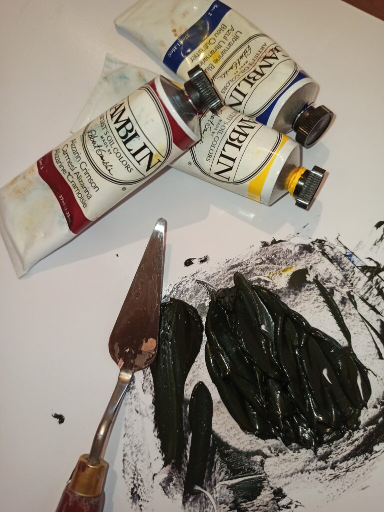
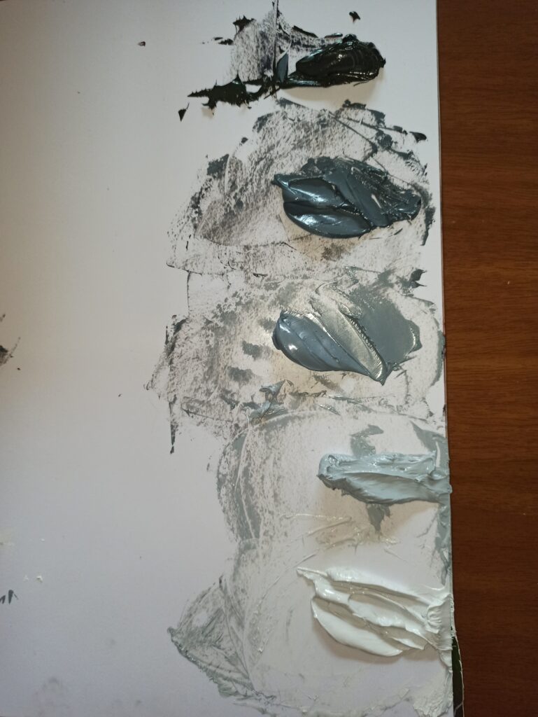
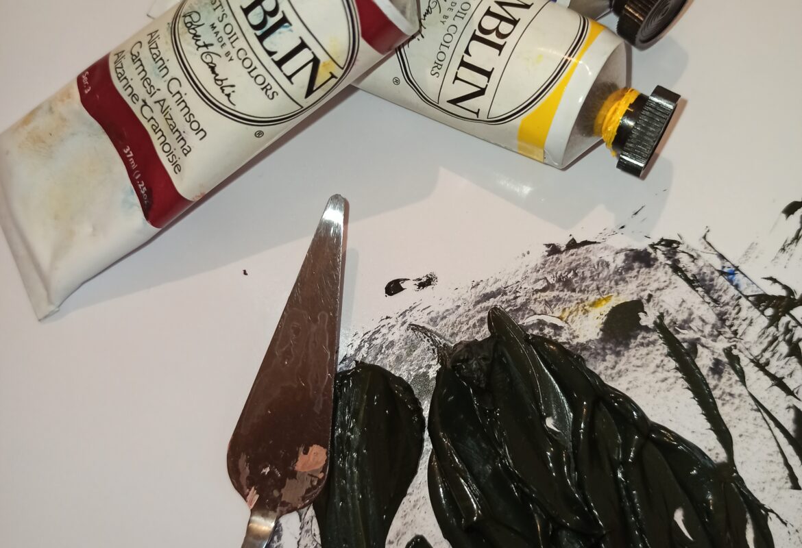
I have mixed three primary colors (in my case Alizarin Crimson, Ultramarine Blue and Cadmium Yellow) to obtain the darkest grey.
It was not easy. Alizarin Crimson is a very strong pigment and I had to struggle a bit to balance it properly with the blue, and dull it down with yellow without making a brown. But it’s done. Afterwards I’ve created a 5-step value palette…
Ready to go! Who still thinks that grey can’t be interesting?
Don’t forget to subscribe to the newsletter HERE, to have an open window on my artistic life in the studio, new available pieces and upcoming exciting events.